|
|
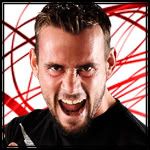
Post by Spike Kane on Oct 31, 2007 4:57:18 GMT -6
|
|
|
|
Post by Kelly Fox on Oct 31, 2007 7:26:12 GMT -6
Woosh. ;D
|
|
|
|
Post by Ruston Bourne on Oct 31, 2007 13:52:30 GMT -6
Thats nice
|
|
Jack Manson
Senior Member
 It's the one that kills, not me!
Posts: 914
|
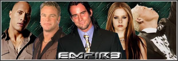
Post by Jack Manson on Oct 31, 2007 16:51:16 GMT -6
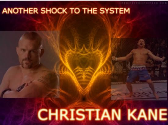
Nice banner, the blurring of Christian and Anthony hurt my eyes though lol.
|
|
|
|
Post by "I'm Gay" on Nov 1, 2007 1:43:44 GMT -6
|
|
|
|
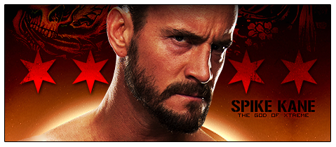
Post by Spike Kane on Nov 1, 2007 5:28:26 GMT -6
thats pretty cool...umm, if the other members wanna go with yours then we shall do so.
Thanks.
|
|
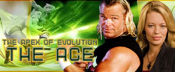
The Ace
Full Member
2008 nCw Road To The Gold Champion
Posts: 675
|
Post by The Ace on Nov 1, 2007 7:11:44 GMT -6
I actually like both, but assuming I can only go with one without being excessive, I pick the second one, because it is smaller, and fits my character better being dressed up in a shirt, also the backwards E to me reflects the screwy principles we (or at least Ace) are proud to uphold...
|
|
|
|
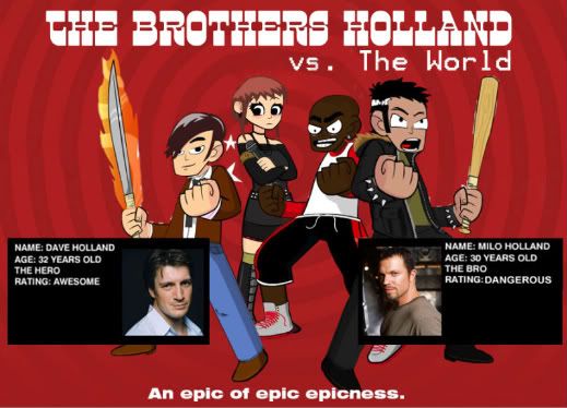
Post by The Brothers Holland on Nov 1, 2007 12:36:20 GMT -6
Plus like Manson said, it doesn't hurt your eyes. But I dunno... I almost feel the best result would be a third entry that kind of merged both styles.
|
|
|
|
Post by "I'm Gay" on Nov 1, 2007 12:45:38 GMT -6
I could go into the PSD and lessen each graphic by 24% and then 49% respectively on each side to make the effect of the 1st graphic without the motion blur.
Unless someone else wishes to step up, let me know and I'll alter my PSD image accordingly.
|
|
Christian Kane
Full Member
Well Personally I'd like to slay the dragon
Posts: 548
|
Post by Christian Kane on Nov 1, 2007 19:49:59 GMT -6
You could give it a bash and see how it goes.
|
|