|
|
Post by Steve Awesome on Feb 7, 2008 13:49:37 GMT -6
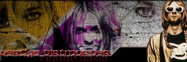
 What do you guys think? Im still kind of new at this so any and all crits would be great. |
|
|
|
Post by Bannedingo on Feb 7, 2008 18:02:56 GMT -6
for a beginner thats impressive, i'd try to smoothe the sides of the images off a bit but it's still impressive. great job
|
|
|
|
Post by Joe Everyman on Feb 7, 2008 21:34:14 GMT -6
Personally, I love it. But yes, some minor changes would help some
|
|
Jack Manson
Senior Member
 It's the one that kills, not me!
Posts: 914
|
Post by Jack Manson on Feb 8, 2008 5:34:23 GMT -6
If you're using Photoshop, use a small soft edged eraser to erase those straight edges and give it a nice soft blur to it, you'll get rid of the sharpness of the corners then.
Not a bad banner mate, I don't think the filter on Awesome and Ace was needed though, but that's just because I rarely use filters myself and don't like most of them lol.
If you kept the character pics as they were when you got them, maybe brightened or darkened them using the adjustment tools to "bring" them out more, and left the background filtered as it is, I think it would be a kick ass banner. That's just my opinion though, not saying it sucks or anything.
|
|
|
|
Post by tylerjacobs on Feb 10, 2008 7:00:28 GMT -6
I think a border would be a nice touch, either that or save it as a jpeg, then open the jepeg and bevel and emboss the whole thing, it'll add to the style you've already gone for.
Nice work amigo.
Which reminds me, I promised Pav a banner...
|
|